About Me

My photo
Welcome to my math blog! The purpose of this blog is to help you stay informed about our learning and experiences that have taken place during our math class. I have also included links your child (and you) may want to use in order to supplement math learning in 5th grade.

Friday, February 28, 2014

Angles


Yesterday, my classes worked with the universal symbols that are used in geometry.  During that activity, they proved their understanding on acute, obtuse, and right angles.  Therefore, I decided to use our time today applying our knowledge of angles, instead of taking notes that are unnecessary.


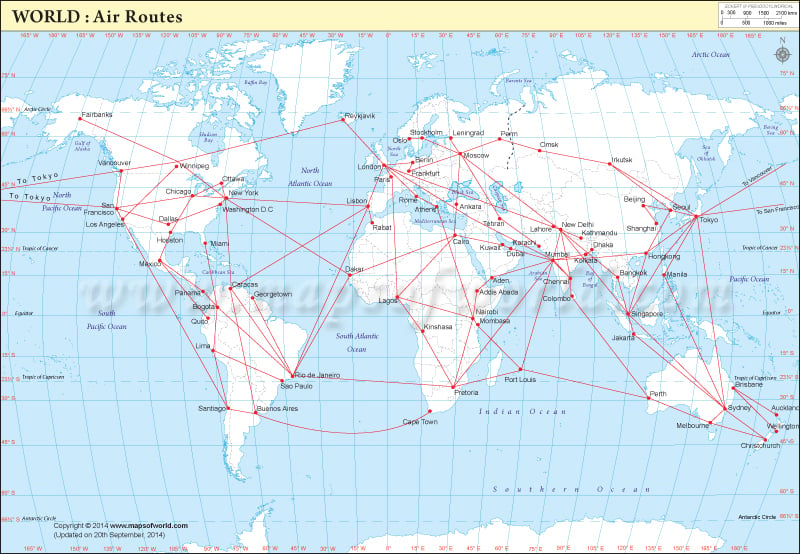
I gave the students an activity from the AIMS Education Foundation called "Flight Paths."  Basically, students use a ruler to connect three cities and form an angle.  Once the angle was formed, I demonstrated using an index card to determine whether the angle was acute, obtuse, or a right angle.  You can watch this demonstration on my video:  Angles.


I did not ask the students to find the exact measurement of each angle, this is not a 5th grade TEK.  Instead, I asked them to label the angle <90 degrees, >90 degrees, or 90 degrees.

The kids really enjoyed this activity!  There was not a moment off task!  The most challenging part of the activity was finding the cities on the map.  I like when they can see how math intermingles with other content areas!


Thursday, February 27, 2014

Geometry Symbols

We began focusing on geometry today.  We began by learning the basic symbols associated with geometry.  I used a resource from Dinah Zike and included the foldable in the student's math journals:


We defined the following terms:  plane, point, ray, line, line segment, parallel, perpendicular, and angle.  I created a video of the definitions and our discussion for those students who were absent today.  The video is called Geometry Symbols.

Once we had our definitions, we worked with an illustration that included all of these geometry points and allowed the students to prove whether the given statements were true or false.  I found the worksheet in Teacher's Helper - Intermediate, February-March 2012 entitled "All The King's Men".  I took the illustration:


then, gave them this grid:


They were to shade in each box that did not match the figure.  I allowed them to work in table groups.  I walked the room listening to their discussion and their explanations of how the statements were either true or false.

I found a few misconceptions that I addressed IMMEDIATELY:
  • Students believed that two lines were not parallel if they were an equal distance apart BUT were not equal in length.  
  • Students thought lines were parallel just because they didn't intersect.  (I had to demonstrate, using pencils, how the lines would intersect if they were longer).
  • Students would assume that any intersecting lines were perpendicular.  They did not focus in on the fact that perpendicular lines MUST have a 90 degree angle.
  • Students did not believe lines were perpendicular if they did not look like the perpendicular symbol.  They assumed that it had to have a line that extended beyond where the lines intersected (which negated corners of shapes being perpendicular).
I was pleased to have had the chance to learn about these misconceptions and address them directly with each class!  This activity compromised the remainder of my class time.  We came back together as a class to compare answers and justify our reasoning for the false statements.

HOMEWORK:  Countdown 5.1


Wednesday, February 26, 2014

Would You Rather and Line Plots


We began today by working with line plots.  Basically, a line plot is an easy way to view a lot of data.  For example, we had collected data on the number of candy hearts that the palm of our hand would hold.  We used the class data to find range, mean, median, and mode for each individual class.  Today, I wanted to combine the data from all three classes.  I decided that a line plot would be the best way to do this.

So, first we determined the least and greatest number of hearts that a palm held in 5th grade (we did this by looking at our ranges from each of the classes.).  Once we knew our range was 23 - 42, we created our line plot base.  Then using the data from each class, we plotted our 'x' on the appropriate numbers.


Now, using the line plot, we found:
  • range (difference between largest and smallest):  42-23 = 19
  • mode (repeats the most):  29
  • mean (average):  31
To demonstrate finding the mean of a large group of numbers, 
I used an excel spreadsheet.  I typed in all of the numbers and showed 
the classes how to use a formula to add them together quickly.  
Then we used a calculator to divide our sum.


  • median (middle number):  29
The kids really like this!  Since the numbers were in order
from least to greatest, it was very easy for them to mark
out the largest and smallest numbers until only one was left.


This was just our review of range, mean, median, and mode.  Now we moved on to the question of the day:


I asked the kids to write the question at the top of the page.  Next, I asked them to write "I think" and complete their thought with their choice (at this point, their decision is based on gut feeling only).  Once we had our predictions, I asked them how we would discover the answer to the problem.  They explained that we would need to determine the number of feet in a mile.  They asked if they could use their 5th Grade Mathematics chart (obviously, I agreed):


I also allowed them to use a calculator, their table, and their brain!  We found that there are 5,280 feet in a mile by solving the equation:  1,760 x 3 = 5,280 feet.

We now decided to determine how many days old we were.  The kids chose to multiply 365 by their age.  Before I could even say much about this, I had students in each class point out that this wasn't the right answer.... it depended on how many days since their last birthday.  I totally agreed and explained that we would use this current product as our estimation.

We paused to contemplate our two answers.  All of my students decided that they would much prefer to get a $1 for every foot in a mile as their number of days they have been alive was less.  However, they were not satisfied with an approximation of their age.... they wanted an EXACT answer.  So, I took them to a website that would calculate this for them:  How Many Days Old Are You?

Before letting them loose on the site, I asked them to decide if it was smarter for me to choose the $1 a foot or $1 a day.  They unanimously agreed that the $1 a day was right for me.  On a calculator, my age (44) multiplied by 365 was $16,060.  When we visited "How Many Days Old Are You?" and put in my birthday, we found that actually, I was $16,326!  By estimating, I had been cheated out of about $300!  Now they really wanted to know their exact age!

Once they visited the site and had their actual age, I asked them to write a conclusion statement.  This time, the statement should begin "I would rather...."  They were to state their choice and justify their reasoning.


As one final question, I asked the classes the bonus question"

BONUS: How old do you have to be before it is more beneficial to take the money based on days alive?

The classes were able to determine that it would be smart for them to chance their choice to $1 per day old once they were 15 years old!  This is the age that passes the number of feet in a mile.

HOMEWORK:  Countdown 4.8

Monday, February 24, 2014

Circle Graphs using Grid Paper


Our last day with our roller coaster measurement.  Last week we spent time making schedules to show how our time was spent riding roller coasters and waiting in line.  Today we turned our data into a circle graph.

To begin, we assigned each roller coaster a color.  We found the number of minutes that we would ride a coaster and then using the assigned color, we would fill in that number of boxes of grid paper.  We did this for each of the five coasters making a strip 25 colored squares long to represent the number of minutes spent on the ride.

We did the same thing with the total number of minutes we would be standing in line for the coasters.  We determined that we would stand in line a total of 106 minutes to ride each of the rides one time.  We kept 106 of our grid squares white to represent this amount of time.  This equated to four strips of grids.

We cut each strip out (one colored, four white) and then taped them together into one long strip.  Once we had the strip, we taped the ends together forming a circle.  We laid the circle strip on a sheet of white construction paper and outlined the circle.  Then we created hash marks on the perimeter of the circle denoting where each of the colors began and ended.  Next we folded our paper in half to find the center point of the circle.  We connected the hash marks to the center point.  Finally we colored in each of the sections with the same colors we used on the strips.


To complete the graph, we gave it a title (How I Spent My Time at an Amusement Park).  We used the colored table as our key.  We noted that the colored portion of the graph was the time spent on the rides, while the white portion denoted the amount of time spent standing in line.


To finish off the day, I asked the kids to complete a 3-2-1:
  • 3 things I have learned
  • 2 things I have enjoyed
  • 1 thing I think should be added
HOMEWORK:  Countdown 4.7


Thursday, February 20, 2014

Measurement: Atop the Drop Kick Coaster (Day 2)

We continued working on "Atop the Drop Kick Coaster."  Today we focused on answering question #4.  Basically, the kids needed to create a schedule of their day.  


Before beginning, I made sure they thought about this as if it were a real day spent at an amusement park (they need to potty and eat).  I also reminded them that it takes time to walk to each of the rides.  The instructions said that all 5 rides had to be included and we needed to show the amount of time spent in line AND the amount of time riding the ride.


So we worked together to create a table to show our work:


Many groups found that they could ride all of the rides and include food and everything and still be done by around 2:00.  I explained that if they had spent $65 on their ticket.... would they really leave the park after 3 hours, or would they keep riding....?  They kept riding.....

HOMEWORK:  Countdown 4.6

KHAN CLUB

30 mastered skills - join the club
48 members

45 mastered skills - Khan t-shirt
27 t-shirts

60 mastered skills - Invitation to Khan Banquet
13 invitations

75 mastered skills - sit at the head table
4 @ the head table

90 mastered skills - medals awarded
2 medalists

HIGHEST Khan mastered skills - "TOP Khan" award
WHO WILL IT BE?!?!


Wednesday, February 19, 2014

Measurement: Atop the Drop Kick Coaster


I wanted to engage my students in some mathematical thinking activities involving measurement.  I have a book called "Calculator Activities:  Measurement" that allows the students to think about math in a real-world, kid relevant way (I mean.... roller coasters!).  They also love that they get to use calculators!

The activity I have chosen for them to work through first is based on going to an amusement park.  In the activity "Atop the Drop Kick Coaster," the students are solving the problem:

How could we figure out the best combinations of 
rides from our day at the amusement park?


This project will take a few days, so we began by discovering how many hours they have to spend in the park.  Next, we learned how to determine the number of minutes we would need to spend either in line or riding each coaster.  Finally, we were only able to BEGIN working on creating two different plans detailing how we could spend our time in the park (including potty and lunch breaks).

The classes are working as table groups and allowed to use calculators to complete the problems, however, each student is required to turn in their own answers to the problems presented.

The class was noisy, but the talk was focused on solving problems that have real meaning to my classes.  Who knew... 

HOMEWORK:  Countdown 4.5

Monday, February 17, 2014

Great Conversation Heart Caper (Day 2)

We continued working with the data we collected last week using our Valentine candy hearts.  By the end of class on Friday, we had determined that there should be about 29 candies in every box.  Today, I wanted us to make a reasonable prediction of the number of each color of candy in a box.  To do that we began by putting all of the 5th grade data on a spreadsheet:


Using our totals for each color, we found the fraction, decimal, and percentage of each color found in our 57 boxes of candy.


We compared the 5th grade percentages to the percentages we found using only our classroom data.  We found that the percentages were really very close.  However, this information is based on each box having 100 candies in it.  We want to know how many of each color there might be in a box with only 29 candies.

So, we wanted to come up with an actual numerical prediction of each color in a box, so we looked at our mean (average) number of each color of candy in a box.  To do this, we took the total number of each color of candy from the three classes and divided by the number of boxes we opened.  For example, 416 purple candies divided by 57 = about 7 purple candies per box.


We placed our predictions in a table and I opened a new box in front of the class.  We compared our predictions to the actual number in the new box.  Here are our results:

Johnson


Dittrich


Whitehead


Finally, the kids wrote to me explaining how the predictions compared to the actual count.  We did discuss that there is an element of machine error with the number of each color placed in a box (there isn't someone counting each color out) and we discussed that the reason that there should be an approximate total number of candies is that each box is packaged by WEIGHT.  Therefore there might be a small variance in total, but not by many (some candies are more dense than others).  

Tomorrow, we will combine the data from the three new boxes and see if the predictions are any closer.

HOMEWORK:  Countdown 4.4

Friday, February 14, 2014

Great Conversation Heart Caper (Day 1)

Like I said yesterday, I LOVE when math is so interesting to my kid they forget they are working!  Of course, when you hand them candy they will do anything for you!

We began our class by tracing around our hands.  I then gave each student a box of candy hearts and asked them to discover how many hearts it took to cover their entire palm.  We collected the data onto a table and next week we will use the data for our weekly range, mean, median, and mode review.


Next, I gave them a packet that we will be working through today and Monday.  I explained that we will be investigating a few questions:


  1. Does the company that makes the conversation hearts put the same number of candies in each box?
  2. Does the company put a certain number of each color of heart in each box?
  3. Can we predict the number of candies, and the number of each color of candy in an unopened box?
We began our investigation by collecting our individual data.  We organized and displayed the information about the color and number of our candies in a table.  We began to interpret the individual data by creating fractions, decimals (using calculators), and percents to describe our data. 


 I then placed all of the individual data on a spreadsheet.  This allowed us to find totals of not only the number of candies in the room, but the total number of each color of candy in the room.

Using this spreadsheet, we collected and organized our class data onto a table in our packet.  We now began to interpret our class data using fractions, decimals, and percents.  Once we had the new percentages, we compared our individual data to the class data to see if we had any commonalities.  I explained that since our individual data is such a small sample, it is not likely that we would have many common percentages.


To get a more precise picture of the data we had gathered.  We revisited the spreadsheet.  We found the range (difference) in the number of candies in the boxes of candies in the class.  Then we found the mean (average) number of candies that were in each box in the class.  We found the mode (most often repeated) number of candies in the boxes.  We also found the median (middle) number of candies in the boxes.  This helped us answer the first question:

Does the company that makes the conversation hearts put the same number of candies in each box?

Based upon our data.... they do (about 29 pieces per box).  I explained that the reason the boxes do not always have an equal number of candies is that the candies are filled by machine.  The machines are programmed to put in an amount equal to a WEIGHT (1 oz).  There may be a discrepancy in the weight of each candy, which would mean more or less candies packaged to meet the weight total.

Here is the spreadsheet with the data collected for each class:

Johnson


Dittrich


Whitehead


Monday we will spend time comparing these spreadsheets, their data, and their pie graphs.  We will continue working with the data collected by the entire 5th grade.

AND